
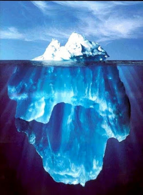
I often have to use a visual concept of the "tip of the ice berg", "things are different as they appear". The picture of an actual ice berg is the obvious choice to use. The Titanic archetype is deeply engrained in our collective memory.
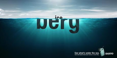
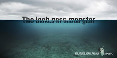
These Sanyo ads show how you can use typography to do the same thing. The first image replaces the image of an ice berg with the actual words, but it gets really interesting when removing the link to the ice berg all together and start using giant text cut in half. Big enough that you can actually read both sentences (sort of) easily.
Not very friendly to audience members with dyslexia though.
Via Ads of the World.
SlideMagic: a platform for magical presentations. Free student plan available.