
An ad from FedEx found on Ad Goodness:
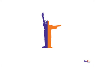 Proof for one of my 101s of PowerPoint design: ditch the elaborate PowerPoint template (with colorful horizontal bars, big logos, and other graphics repeated on each page). From a mile's distance, anyone can see that this is an ad by FedEx. Achieved by consistent use of colors on a completely white background. They can almost do without the small logo in the bottom right.
Related reading: the 2nd post on this blog from July 2008
SlideMagic: a platform for magical presentations. Free student plan available.