
A chart concept I used yesterday in a client's presentation to demonstrate the progress of personal computing technology over the past decade (technical details taken from this post by AdamH).
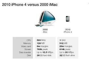
There is no point to construct complicated bar charts to compare the values of the technical specifications, they are similar (the point of the chart). Rather what is important, is to shrink the image of the iPhone so that it's more or less to scale with the much bigger iMac.
There is no point to construct complicated bar charts to compare the values of the technical specifications, they are similar (the point of the chart). Rather what is important, is to shrink the image of the iPhone so that it's more or less to scale with the much bigger iMac.
SlideMagic: a platform for magical presentations. Free student plan available.