
Most slides with images work best when you scale up the photograph until it bleeds of the page.

Making the image a bit smaller leaves a distracting white border around your slides that does not look good when projected on a big screen.

However, recently I started using a layout that is very often used in print advertising. An image which is more horizontally cut and more white space above and below the image. It is maybe not the best for large on-screen key note presentations, but it looks great for corporate decks that are discussed in a smaller setting.
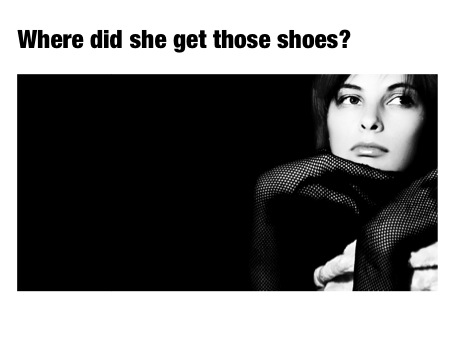
This layout is often used in CD covers, see Similar to this album cover of a 1990s hit by Everything but the girl:

Making the image a bit smaller leaves a distracting white border around your slides that does not look good when projected on a big screen.
However, recently I started using a layout that is very often used in print advertising. An image which is more horizontally cut and more white space above and below the image. It is maybe not the best for large on-screen key note presentations, but it looks great for corporate decks that are discussed in a smaller setting.
This layout is often used in CD covers, see Similar to this album cover of a 1990s hit by Everything but the girl:
SlideMagic: a platform for magical presentations. Free student plan available.