
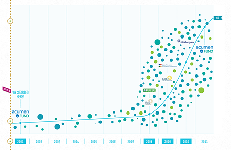
The new web site of the Acumen Fund is a great example of how presentation and web design is blending. Gone are the navigation menus, environmental statements, and other wasted screen real estate. Instead, the site is a vertical series of visuals that equally could have gone into a presentation.
I often recommend this web site design approach to early-stage start ups. Once you have designed your investor presentation deck, you can simplify slides, take out the confidential ones (financials, pipeline, IP) and you have the ingredients for a great, simple web site, that shows potential investors clicking through to your URL a message that is consistent with your pitch.
By the way, Acumen is doing some great work to tackle poverty. If you are interested, join the community here to find out more.
SlideMagic: a platform for magical presentations. Free student plan available.