
Things are never sure in business analysis. One option to deal with uncertainty is to use data ranges: $3-5m instead of ~$4m.
While it might be the correct approach to qualify your analysis, I do not find it visually pleasing. My approach would be to settle on a point estimate, and put a note on your slide that these numbers are estimates. It also easier to discuss with your audience, it is difficult to refer to ranges all the time: “Next year’s sales of $3-5m”.
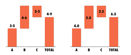
One additional complication, ranges amplify when you add or subtract them. In the chart above, you see that 6.5 equals to a range of 4-9 instead of 6-7 for example. If this is the point you want to make, our sales forecast can fluctuate wildly because of things we do not know, then use the chart. If you just want to give a small range to show uncertainty about the exact value go for the point estimate.
And one more issue, a range of $1m more or less can be a big difference if you apply it to a small number, or a big one: 1-2 versus 10-11 for example. The first is a 100% variation, the second 10%. So, to do it correctly you have to write down in your chart: 1.0-1.1 and 10.0-11.0. All this just makes it too complicated to have a meaningful strategy discussion.
And another one: ranges are a pain to use in calculations, as seen in the slightly counter-intuitive column chart above. (See an earlier post on how to make water fall charts here).
Bottom line: I try to avoid ranges whenever I can.
While it might be the correct approach to qualify your analysis, I do not find it visually pleasing. My approach would be to settle on a point estimate, and put a note on your slide that these numbers are estimates. It also easier to discuss with your audience, it is difficult to refer to ranges all the time: “Next year’s sales of $3-5m”.
One additional complication, ranges amplify when you add or subtract them. In the chart above, you see that 6.5 equals to a range of 4-9 instead of 6-7 for example. If this is the point you want to make, our sales forecast can fluctuate wildly because of things we do not know, then use the chart. If you just want to give a small range to show uncertainty about the exact value go for the point estimate.
And one more issue, a range of $1m more or less can be a big difference if you apply it to a small number, or a big one: 1-2 versus 10-11 for example. The first is a 100% variation, the second 10%. So, to do it correctly you have to write down in your chart: 1.0-1.1 and 10.0-11.0. All this just makes it too complicated to have a meaningful strategy discussion.
And another one: ranges are a pain to use in calculations, as seen in the slightly counter-intuitive column chart above. (See an earlier post on how to make water fall charts here).
Bottom line: I try to avoid ranges whenever I can.
SlideMagic: a platform for magical presentations. Free student plan available.