
A number out of contrast is hard to put in perspective. That is why our measurements originally were all somehow related to things we can compare to: feet, kilo (1 litre of water), inch (thumb). But when things get really big, or really small it is hard to absorb the scale of something.
In presentations, you would use bar or column charts to compare 2 numbers to each other. The best comparisons are those where the audience can relate to.
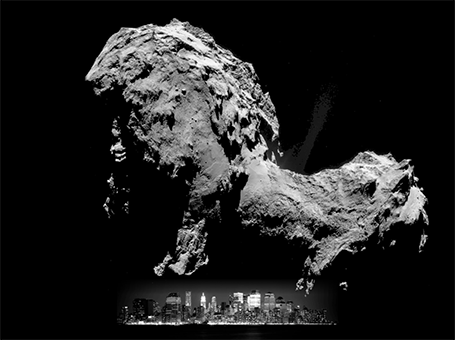
Many people tried to use images to put the size of Comet 67P in perspective (example, example). Below is my attempt, where I put the 4.1km height of the big blob in perspective to the 158m height of 26 Broadway in New York. I think the vertical compositions are much more dramatic than the juxtapositions on horizontal maps.
In presentations, you would use bar or column charts to compare 2 numbers to each other. The best comparisons are those where the audience can relate to.
Many people tried to use images to put the size of Comet 67P in perspective (example, example). Below is my attempt, where I put the 4.1km height of the big blob in perspective to the 158m height of 26 Broadway in New York. I think the vertical compositions are much more dramatic than the juxtapositions on horizontal maps.
SlideMagic: a platform for magical presentations. Free student plan available.