

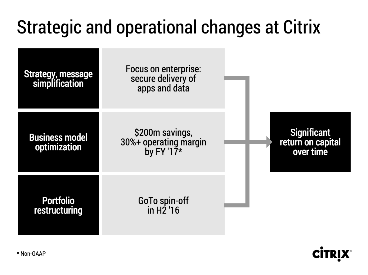
Citrix announced a corporate restructuring recently. The slides that were used are typical of many corporate PowerPoint presentations. Here is an example:

This slide looks like it came straight out of the consulting report that preceded the decision to make the changes. There are a number of things that can be improved:
- The look & feel does not match Citrix' clean black and white corporate identity
- The slide uses a standard Microsoft PowerPoint smart object, with "dirty" gradients
- No attention has been given to typography: "H2'16" is orphaned on a 2nd line, the light boxes are too narrow to contain 3 lines of text
- Messages are repeated on the left and right side of the chart
- There is a cause and effect relationship in the chart (we do this and get ROC in return) that is not reflected in the way it is laid out.
- The headline is a but woolly.
I tried to fix these issues in this quick makeover in my presentation app SlideMagic. I kept the 30% margin and $200 cost cut info in the business model optimisation box, although you could argue that that is an outcome of the strategy as well. A true business model optimisation would be "price increases" or something.
If you want you can copy and clone this slide to your own SlideMagic account by clicking this link. Not yet a SlideMagic user? Sign up here to try it out.