
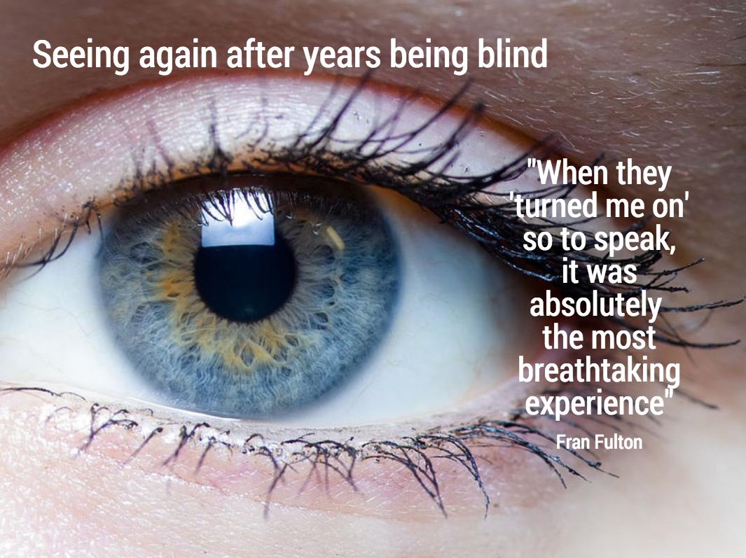
This image that I saw on Twitter has composition problems that you often see in presentation slides:
- The text in the box does not have enough breathing space,
- The quotation marks disturb the balance and alignment of the text box
- The line breaks are not placed carefully enough, breaking apart words that belong together.
What is it like to see again after years being blind? @roseveleth investigates http://t.co/HJSdFGZNzL pic.twitter.com/XvmwYUgC7q
— BBC Future (@BBC_Future) June 4, 2015
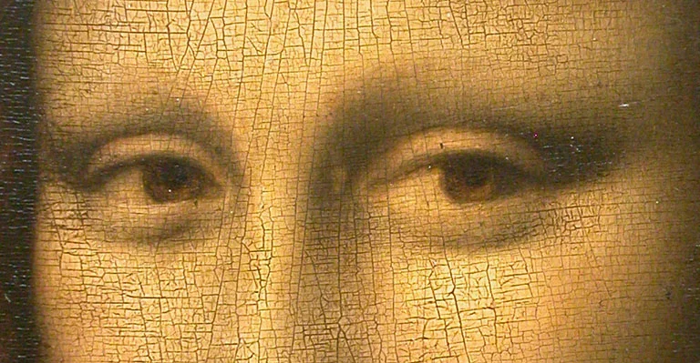
Art: detail of the Mona Lisa
SlideMagic: a platform for magical presentations. Free student plan available.