
See the ad below. Something is not right. It is hard to see what it exactly is, but the image is not natural. The light? The shadows? The 3D proportions?
Photo manipulations are increasingly easy to make, but the technology of image editing is not the problem. We already learn as a child that getting 3D to look right on a 2D canvas is hard. Architects and designers use a full 3D design environment to create realistic-looking simulations.
But, a 3D composition can look great even if the designer does not even bother to get the proportions right. Art would be have been incredibly boring if painters had stuck to the conventions all the time. Luckily they did not.
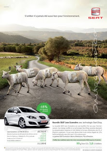
The problem are those compositions that are almost right, but not 100%. Look at the ad: very good technical execution, no ruffled borders around the sheep, drop shadows re-created, letters embedded in the fur: far better than most PowerPoint designers (including me) could do. Still the viewer is distracted: what is going on here? A distracted audience does not absorb messages.
In short: distort reality completely or forget about photo compositions all together.
Related, one of my earlier posts contains some useful links about photo manipulations.
Ad via Ads of the World.
SlideMagic: a platform for magical presentations. Free student plan available.