
I stumbled across this article in The Scientist today: life sciences scientist discussing posters that are used to present work in scientific conferences. It is worth a read, presentation design discussed from another angle.
Also have a look in some of the links in the side bar with more related content. (Don't click around too much as after trying to access too many pages the site requires subscription).
Some points that are made (some more serious than others):
 (Image source on Flickr)
The article does not provide a hot link to the Flickr group "Pimp my poster", you can find it here.
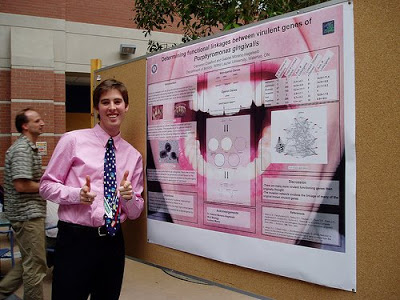
I randomly clicked through some posters, here is an interesting one as an example of the sort of presentations scientists are preparing.
(Image source on Flickr)
The article does not provide a hot link to the Flickr group "Pimp my poster", you can find it here.
I randomly clicked through some posters, here is an interesting one as an example of the sort of presentations scientists are preparing.
 I learned about a new set of communication challenges today.
- PowerPoint has killed the scientific conference poster, the program is not build for it, but people do not want to spend a lot of money on huge trial prints that in the end are not good
- Color-coordinating the clothing of the presenter with those of the presenter (scientifically proven) improves communcation effectiveness
- There is a bigger debate on the "death of the scientific paper" with ever increasing data sets and new presentation technologies available
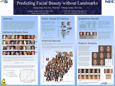
(Image source on Flickr)
The article does not provide a hot link to the Flickr group "Pimp my poster", you can find it here.
I randomly clicked through some posters, here is an interesting one as an example of the sort of presentations scientists are preparing.
I learned about a new set of communication challenges today.
SlideMagic: a platform for magical presentations. Free student plan available.