
The only up side of economic turmoil is probably that there is plenty of data available for interesting visualizations. The New York Times posted this chart: (click for a larger picture)
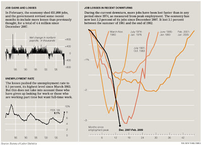
I like it because the designer gave some thought about what metric to put in. He/she could have shown a times series of GDP growth, absolute unemployment, or unemployment rate to name just a few. That's why I do not like these automated PowerPoint chart wizards, it makes you skip the step of actually thinking about what metric really makes your point. (And more importantly, what are the 15 metrics you can get rid of without changing anything to the message of your slide).
Via Junk Charts, an excellent source of data visualization discussions. For more frequent updates about the financial crisis (including many data visualizations) follow Paul Kedrosky.
SlideMagic: a platform for magical presentations. Free student plan available.