I used to recommend to stick to standard Windows fonts in order to avoid compatibility issues when presenting on other computers than your own. I am changing my mind, the risk of technical issues is still there, but the benefits of custom fonts is much greater.
Standard PC fonts (Times roman, Calibri, Arial, etc.) just do not look good. In dense body text, this is not such a big deal. But as PowerPoint slides get fewer and fewer text, their design start to look more like a poster with big headlines. And in posters, typography is a huge deal.
This post on the PowerPoint Ninja blog explains how to overcome compatibility issues by embedding your custom font inside the presentation. When you send it to someone else, she will see the correct font.
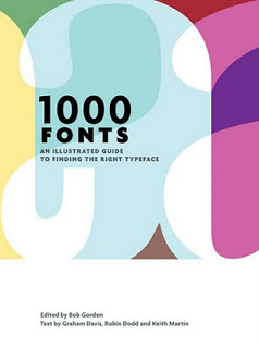
You can find your inspiration for fonts on one of the many fonts web sites, paying close attention to the small prints in books (they often mention which font was used) or through books like this one that I picked up in a Tel Aviv book store: 1000 Fonts (affiliate link).
Standard PC fonts (Times roman, Calibri, Arial, etc.) just do not look good. In dense body text, this is not such a big deal. But as PowerPoint slides get fewer and fewer text, their design start to look more like a poster with big headlines. And in posters, typography is a huge deal.
This post on the PowerPoint Ninja blog explains how to overcome compatibility issues by embedding your custom font inside the presentation. When you send it to someone else, she will see the correct font.
You can find your inspiration for fonts on one of the many fonts web sites, paying close attention to the small prints in books (they often mention which font was used) or through books like this one that I picked up in a Tel Aviv book store: 1000 Fonts
SlideMagic: a platform for magical presentations. Free student plan available.

