
Nature and artists are still better at producing certain colors than computers. Look at the famous painting Poppies at Argenteuil by Monet. If you were the pick the blue green color and copy the RGB values into your PowerPoint presentation, the result would be dull. The rhythm of the brush strokes adds something.
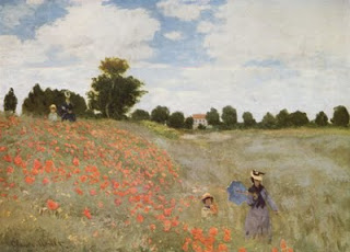
In spring, there are many flower fields like these in Israel. The green blue color is created by the contrast between the top and the bottom of the leaves: grey green and yellow green. The wind moving the leaves creates the color effect. In an earlier post I discussed a painting by Jan van Eyck with a similar effect of alternating and interacting colors.
This painting is also a great example of how to create movement in a static image. The horizon and the diagonal line between the two ladies set the composition. Look how the red flowers are blurry dots of paint without much detail, and how they get incredibly big close to the front. Flowers in the wind never sit still, but rather we watch them go round, leaving a much bigger impression than the space they actually occupy.
This painting has multiple levels of experience, an almost impossible feature to recreate in a PowerPoint slide, but a reminder about what visuals ultimately are: pieces of emotional input. First you see a landscape, then you see things moving in the wind, hear the wind whistling, feel that spring sensation when you venture out of your cold house into the sun and sense your skin warming up from the outside. The bright red, blue green contrast, plus the movements of the children running down the hill might just remind you that life is all about those simple pleasures and moments of beauty.
SlideMagic: a platform for magical presentations. Free student plan available.