
The preview of the new Microsoft Office 2016 is out (finally) and I have installed it on my production machine letting it do all my presentation design work for clients. (You can download the Office 2016 preview here)
- It looks beautiful. PowerPoint 2016 for Mac looks exactly the same as PowerPoint 2013 for Windows. A calm flat user interface. Working in a beautiful software environment always encourages you to create beautiful presentations.
- The whole interface feels faster, snappier, and smoother, somehow. This is especially true for Excel. The current version of Excel for Mac has a highly annoying latency when entering data in cells.
- Subtle changes to the default colours and fonts. Gone are the boring olive greens of the old PowerPoint colour scheme. Calibri light looks great on Retina displays. Gone are the default gradients and drop shadows. Gone are the tick marks in data charts.
- The commenting infrastructure is nice for collaboration with other people
- Full integration with OneDrive cloud storage (if Microsoft has guts they should add Dropbox as well, and maybe even Google Drive).
- Now PowerPoint gives suggested snap lines to place objects, automatically distributing and aligning things on your screen.
- The grid behaves more normal with a centimeter ruler. If you accidentally move a grid line (yes, this still happens) it is easy to move it back to the right position.
- Now text and shape backgrounds have the exact same colour rendering, an annoying bug in PowerPoint 2011, where despite selecting the same RGB value, colours on text and shapes would render differently.
There are a few important things that are missing:
- The ability to customise the toolbar at the top (here is where I put my align and distribute buttons for example) (this was possible in PowerPoint 2011)
- It is still not possible to embed fonts with a presentation saved in PowerPoint for Mac (it works on the Windows version)
I think PowerPoint 2016 is so good that it has gained the edge over Apple Keynote. Recent user interface changes in Keynote have made the workflow a bit slower. You need to navigate around too many menus to do basic things such as colour changes. Keynote looks nice and clean, but this organised UI comes at the expense of usability.
But before PowerPoint can take the trophy, some bugs that are still in the preview need to be ironed out. I am confident that Microsoft will be able to do this over the next few months until the official release. Here wo go:
- Font rendering: The software UI looks clean and crisp, but the presentation fonts look a bit fuzzy. In Excel, there is an inconsistency of fonts across the spreadsheet. It looks fine towards the top and bottom of the screen, but not in the middle.

- The colour picking is not completely fool proof, especially when you want to use it define new theme colours for your presentation
- There are frequent crashes, save your work
- Font variations to not come through as in PowerPoint 2011. For the Apple Helvetica font, the bold condensed variant does not pop up for example
But hey, you are developing a PowerPoint killer?
Correct (and therefore my review is biased), I think that PowerPoint and Keynote have too many features, and leave too much design freedom to a layman designer. The result: boring bullet point presentations. My presentation app SlideMagic is trying to address these issues. But that is a separate discussion.
UPDATE: This post was corrected, shape booleans are still present in PowerPoint 2016
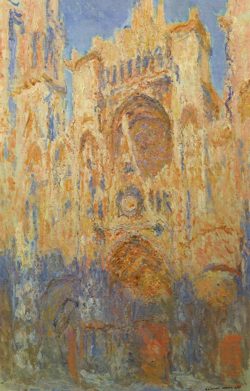
Art: Claude Monet, Rouen Cathedral, Facade (sunset), harmonie in gold and blue 1892-1894 Musée Marmottan Monet Paris, France. Sign up for SlideMagic, subscribe to this blog, follow me on Twitter