
When making a table, what to put in columns, what to put in rows? There is no absolute rule here, but this is what I consider when deciding (some of these can contradict each other).
- It easier to fit lots of rows then lots of columns.
- Long labels go in rows
- Year on year trend: years go in columns
- Feature/competitor comparison: features in the rows
The most important things is that you never should assume that the layout in which the source data was presented to you is the best way to put that table on a slide. Next to swapping rows and columns consider:
- Shortening column labels
- Re-sorting rows and columns so that check marks / similar table content is grouped together
- Group together multiple rows, or multiple columns if their content is the same as the neighbour
- Cut text as much as you can in table cells. Side comments and sentences can go in the footnote
- Design a table at 2 levels: Level 1 (using colouring of cells) to communicate the pattern/conclusion, level 2 (using text) the explanation of the colouring for when people read the slides after the presentation
- Harmonise column widths and row heights to get a grid pattern that is as calm as possible
- Avoid boxes/outline lines, rather work with light grey boxes
Users of my presentation design app SlideMagic do not have to worry about a lot of these things, the app will do it form them.
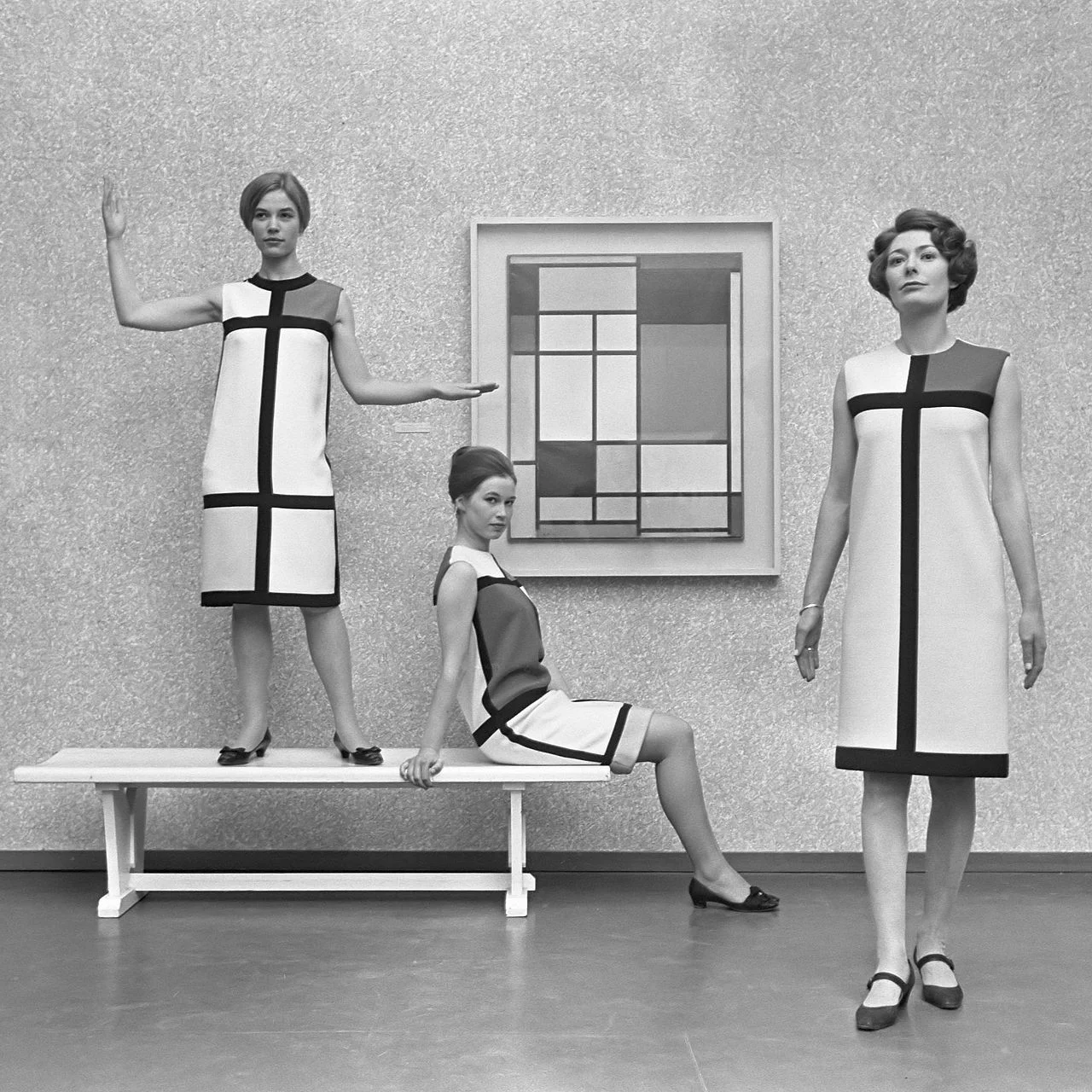
Art: Mondrian dresses by Yves Saint Laurent shown with a Mondrian painting in 1966.
SlideMagic: a platform for magical presentations. Free student plan available.