
This is the hardest thing in presentation design. Many people fill up a slide with far too much detail. But others write such high level, abstract concepts, that the slide says nothing at all. What is the best middle ground?
Let's declutter a busy slide. This is a mental exercise I usually go through
- Cut out/cut through buzzwords and filler words
- Cut out side tangents
- See how many points the slide wants to make. If it is just a sequential listing of independent story elements (i.e., the slide does not want to convey a relationship between them), we can them spread them out: each slide gets one point.
- If the elements have some sort of relationship in them, it is usually one of 2 kinds: a contrast, or a ranking of pro/cons of different options, or a cause/effect story of multiple factors influencing each other leading to a conclusion
- I try to draw the pro/con table or process flow diagram on a piece of paper so I understand what is actually going on. I draw multiple versions where I simplify things (combine rows/columns, swap rows/columns, boxes, arrows) until I get to a clean version of the message
- Now I go in slide design mode:
- First slide is a generic one: "our solution is better because we managed to paint the object blue instead of yellow. Yes it might not sound like it, but this is a big deal, let me explain why"
- This is followed by a number of slides where I explain key sub points in more detail
- Now that I have warmed up the audience, I can show a stylised version of my paper napkin that brings the whole thing together.
In all of this, step 5 is the crucial one. One little sketch like this can be the foundation on which an entire presentation is built.
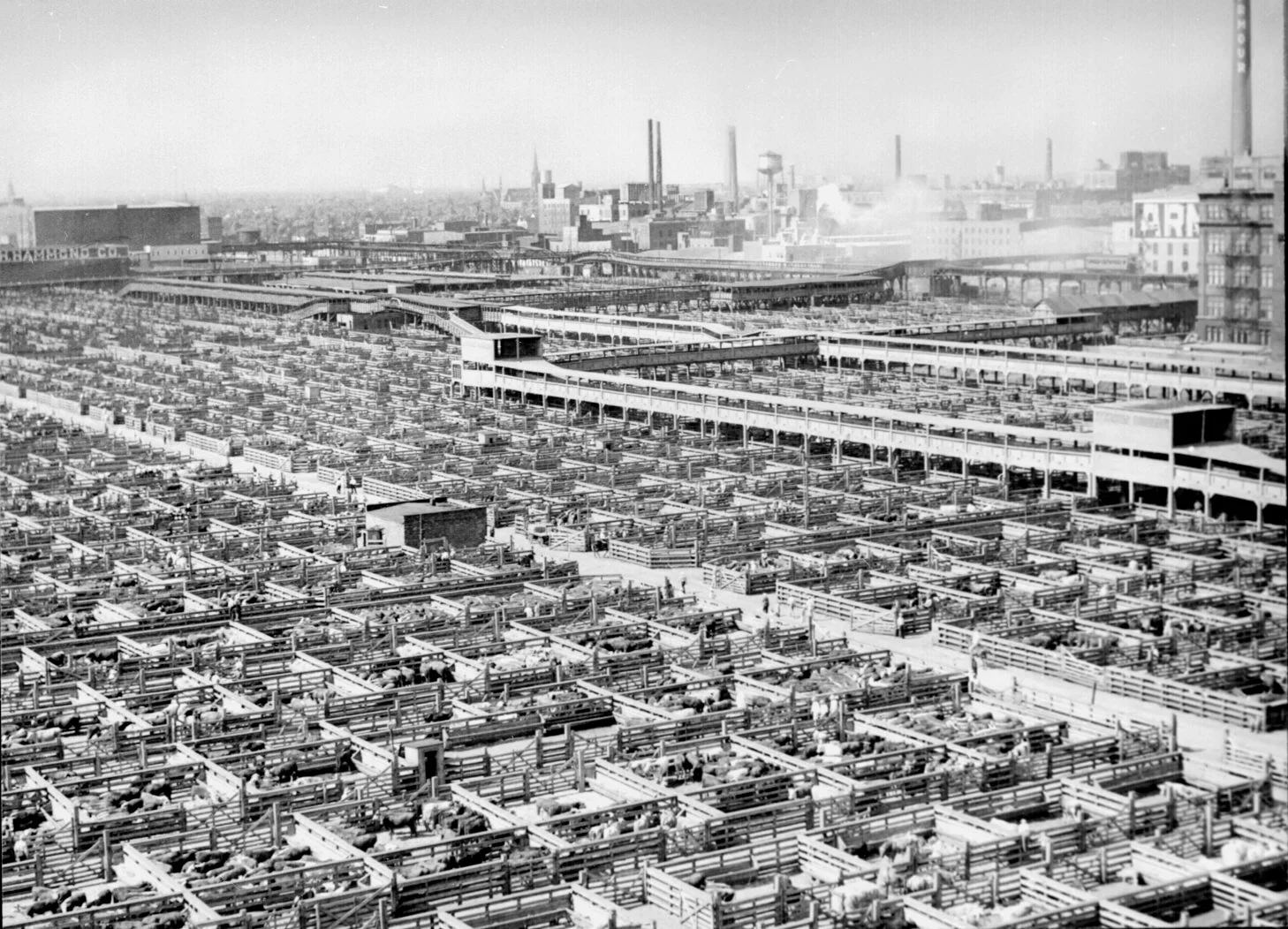
Picture: live stock in Chicago, 1947
SlideMagic: a platform for magical presentations. Free student plan available.