

A question came in on Twitter the other day:
@ideatransplant How to discuss pros and cons of 4 things? What sort of layout would you prefer?
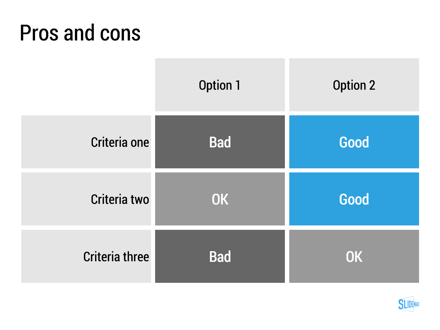
— Yoni Tantra (@yonitantra) January 3, 2016My answer is: a simple table, like this one I prepared quickly in my presentation app SlideMagic (you can clone it to your own SlideMagic account in the presentation template file that contains on the slides I have used on this blog).
The difference between a good pro/con slide and a bad one is not the design in itself, it is how your present the argument. A presentation slide is a tool to get a decision, it is not a laundry list of pros and cons that you evaluated in your analysis. Put your analysis aside, and design from a blank sheet of paper:
- Group similar arguments together, if an argument is sort of the same, combine them
- Sort the rows in the table in such a way that things visually line up. For example you start with rows where both options are "good" (all blues), then do the "OK/good"s, then the "OK/OK"s. etc.
- Isolated and focus those arguments that are going to drive the decision and/or are controversial. "Option 1 is cheaper, option 2 is faster but the what will make the difference is whether we think [criterion 3] is important.
- Cut words rigorously until you have a page that is still meaningful but does not look cluttered.
SlideMagic: a platform for magical presentations. Free student plan available.