Below a repost from 3 years ago, an blog post I put out on a Medium publication that I am taking down. Putting it out here to preserve it.
You can design better presentation slides by getting rid of engrained habits that can go back decades.
Sometimes I work with teenagers to teach them about presentation design. To my surprise, they often are much better students than “grown ups” who are supposed to benefit from decades of business experience. Here is a theory why.
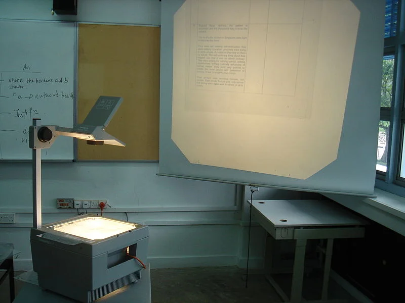
Transparencies for overhead projectors encouraged you to copy pages out of a book and uncovering paragraphs or key points bullet by bullet. Moving to PowerPoint, people just kept writing these bullets.
The first visuals that you felt compelled to project to an audience were data charts: lines, bars, columns. These type of graphs needed to have a title in the top left and a source at the bottom. Most slide designs today use a big title at the top left, other typography on the page is almost never bigger than the title. Very rarely, people leave the title out all together.
Pictures are low resolution and take a lot of memory, hence you can only put in small images in a presentation document that you need to email someone.
PowerPoint was created as a mouse-based drawing software, rising alongside Microsoft Windows. Everything could be dragged, and resized easily to fit. Cropping an image was tricky. The first plasma TV screens confirmed to us that it was OK to stretch an image out of proportion, as long as it fitted whatever you needed to fill easily.
Word processors enabled us to ponder a sentence over and over, editing, adding words until it encapsulated everything we wanted to say. This leads to buzzword-loaded, fluffy, mission statement-type business prose that you would never use in spoken conversation. We were not trained to write razor sharp newspaper headings.
In a word processor, the time it takes to read a document equals the total number of pages. So, to cut the time it takes to deliver your presentation, you need to cut slides. If you still want to cover the same content, just reduce the font size and cram in more information in a slide. Page count rules.
When writing, you create thought flow from top to bottom, so in PowerPoint there is no need to use other visual techniques to express contradictions, overlaps, tensions, win-wins, from-to movements, transitions.
There were only 3 types of fonts: sans serif, serif and Comic Sans, so that’s what we use in Microsoft Office documents.
To make a point we use all those powerful software tools to add stuff: bold, underline, shadows, bright colors. It never occurred to us that by de-emphasising things around what we want to emphasise, it would stand out naturally and more beautifully.
Next time you design a presentation, think how you would tackle it without the baggage from the 1990s, just like a teenager today.

