
When you want to show a P&L with very few lines, consider using a column chart instead of the more traditional data table. In the chart below you can see how to go about it. Use a bold color for the profit series, a light color for the COGS, and manually add the gross profit as bubbles.
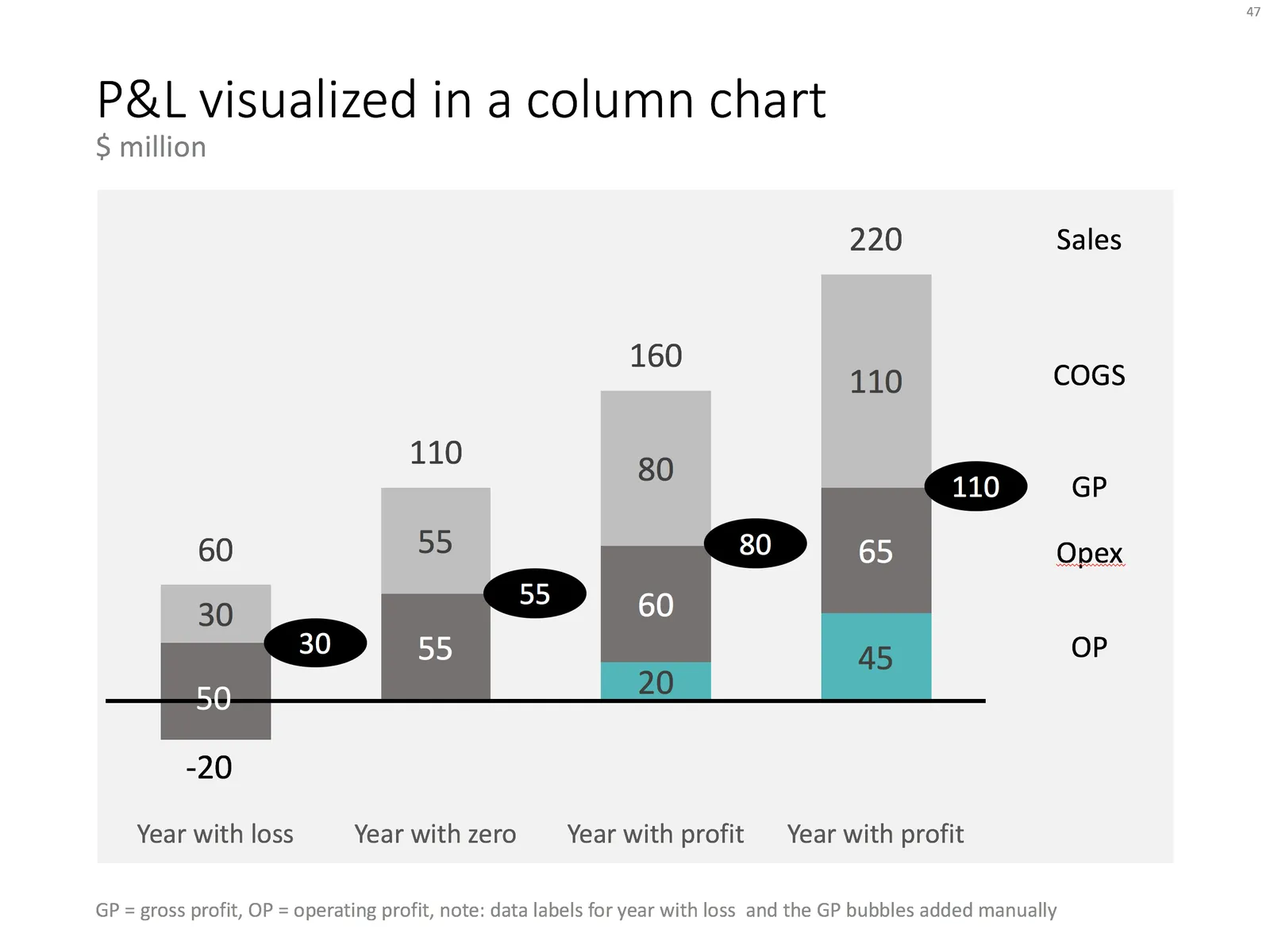
Things get a bit trickier for years where there is a loss. You create a separate data series in the same color as the last cost category (opex in this example), and calculate how much of the opex goes under the line and how much above. Tweak data labels manually. For these types of charts it is best to sketch them completely on a piece of paper, and then fiddle with PowerPoint/Excel to get it right.
The column chart works well, it shows a number of trends in 1 slide: sales growth, profit growth, and how fixed/variable certain cost types are.
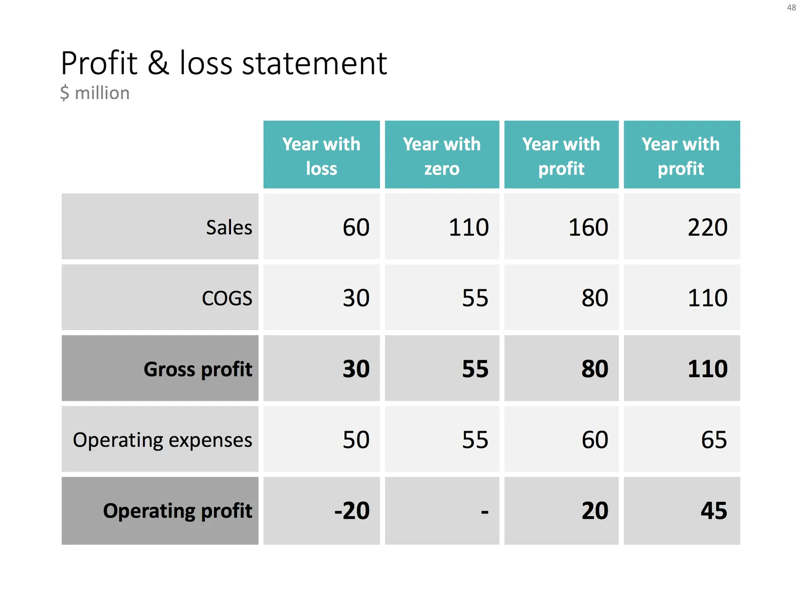
Below is the data I used to create this chart.
You can recreate your own chart with the description above, or download the example from the SlideMagic template bank.