

I think people are spending way too much time on creating corporate presentation documents for internal company meetings where the objective is to get your colleagues to agree on something that needs to happen next. Not every meeting is your all company annual sales kick off.
Presentation cliches can be effective visual shortcuts to get your point across. People have seen them before, instantly connect to the concept, and you can move on. The challenge is to make your slide look decent, maybe even referring to the cliche in a tongue-in-cheek way.
Below is what I tried to do to the infamous tip of the iceberg slide.
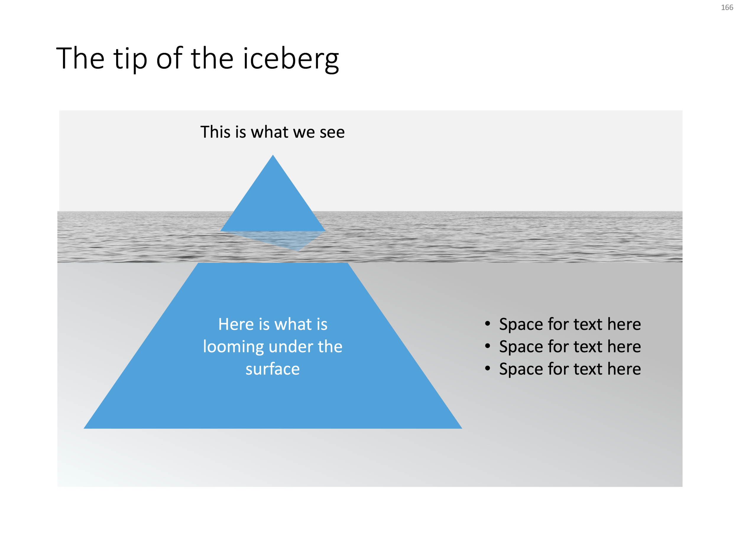
The tip of the iceberg presentation "classic" (or cliche?)
- Don't try to make it look too photo realistic, but rather use an abstract simple geometrical shape, and use the presentation accent color (instead of white against a dark background)
- Keep the slide very simple, but the depth effect is actually created with clever layering of (partly semitransparent) shapes and image crops, it took me some head scratching to figure out
- Shift the whole composition to the side to leave some more space for text, if you need it.
All in all, this chart looks better than a boring list of bullet points that describe some looming threat you want to warn your colleagues about. Just resist the temptation to fill that empty piece of arctic ocean on the right or the crisp polar sky with text.
If you want, you can download the tip of the iceberg slide here.
Photo by paul morris on Unsplash