

PowerPoint (and Keynote) can be very useful alternatives to word processors:
- It is easy to set up a document quickly, using empty pages with headers to organise your ideas
- It is easy to move things around
- It is easy to combine text, graphs, images, and data
- It is easy to collaborate with others in this well-known user interface
As a result, many of my clients use "slideocuments", presentations that are meant for reading, discussing, and decision making, rather than being the backdrop of a stand-up presentation in front of an audience.
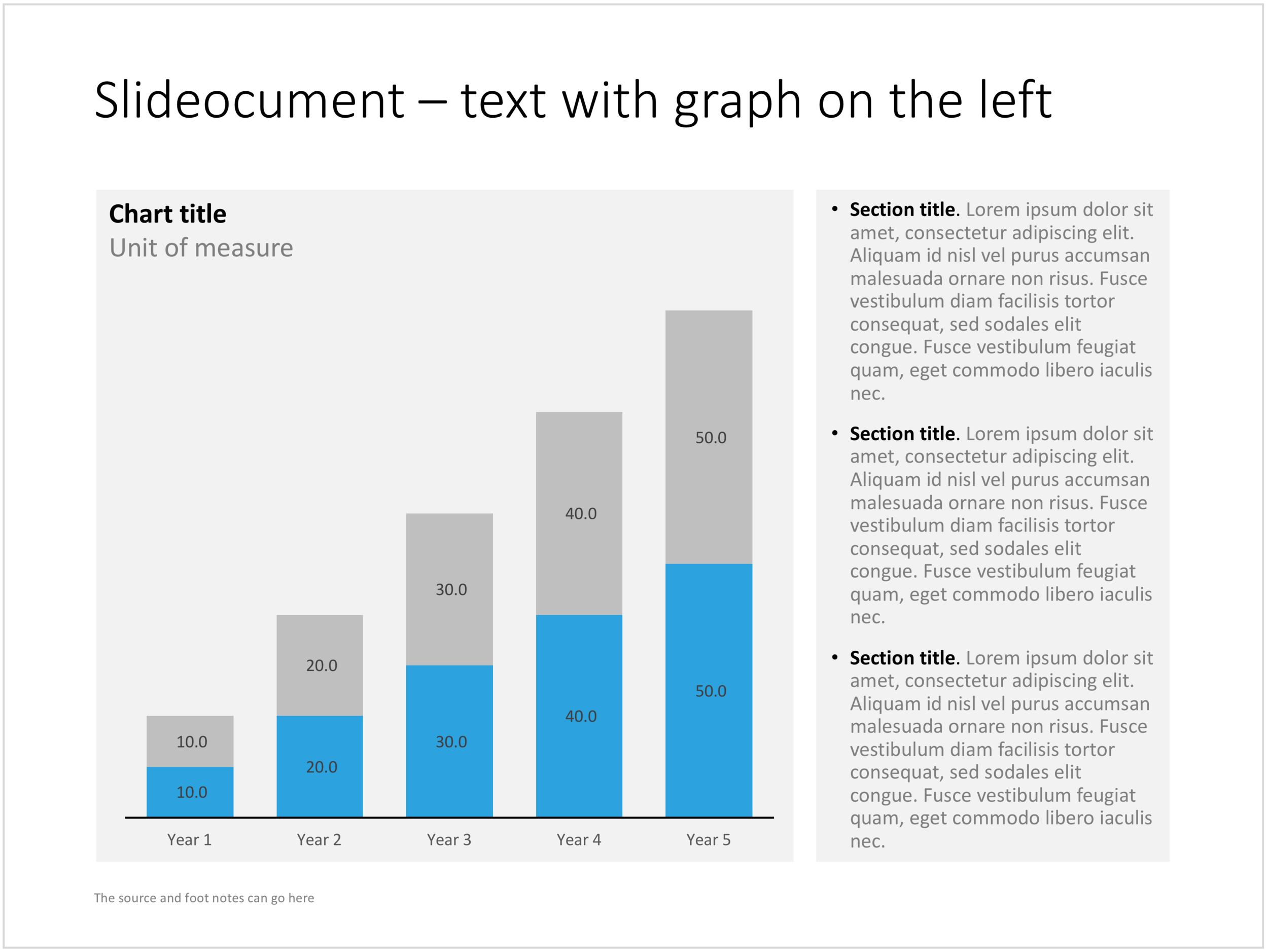
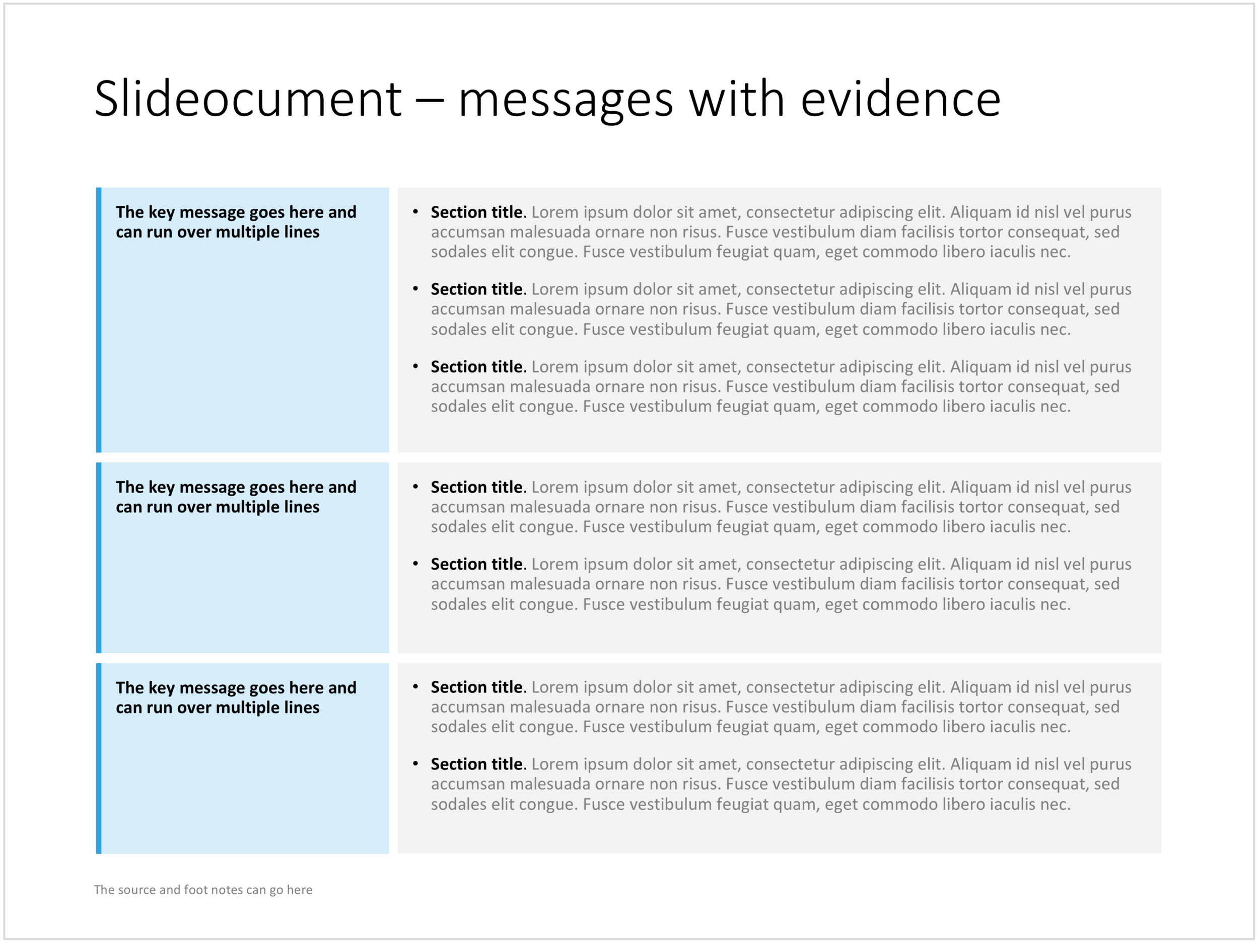
A good slideocument slide with dense text is different from a poorly designed bullet point slide (with dense text). It follows the layout principles of print design: white space, text in readable columns. Poor bullet point slides usually have a font size that is too small for a live presentation and too big for reading. Text runs from left to right across the entire screen, which makes it hard to read, especially in wide screen format. The structure of bullet points is not clear. The text of the bullet points is too long to be a headline, and too short to be a clear paragraph.
I added a few slideocuments to the SlideMagic store recently. Feel inspired to copy the design, or click on the images to purchase a ready slide. Of course, subscribers can add the slides to their collection at no cost.

Cover image by Laura Kapfer on Unsplash