

Today, I added 2 slides that show a balance sheet to the template store.
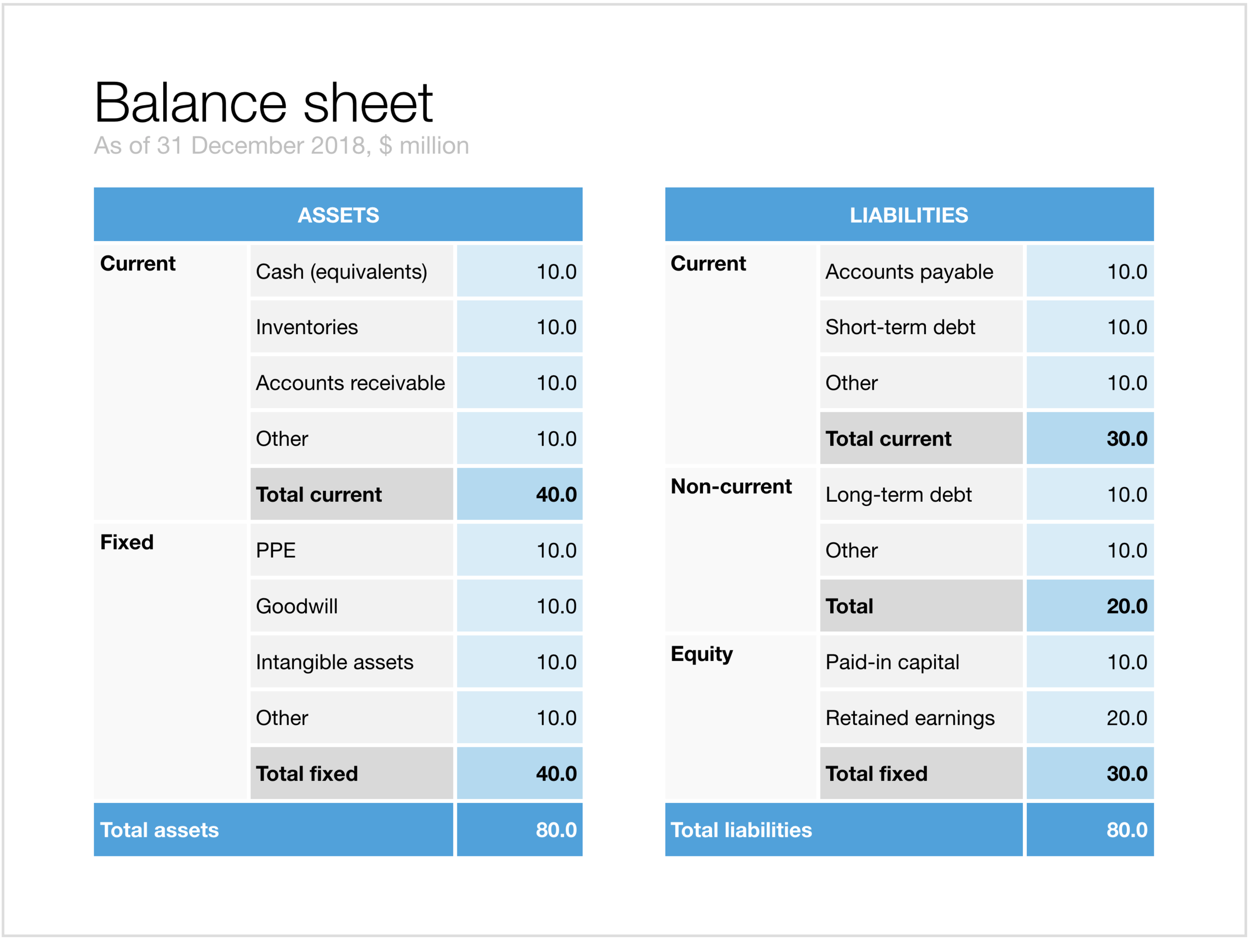
The first is a traditional table format. But this PowerPoint version is a bit different from the a typical balance sheet in an annual report to improve the readability. Usually, the PowerPoint presentation with the financials is not the legally binding one, so we can omit some details that clutter up the page. This table has fewer lines (consolidating multiple entries into one), and the amounts are rounded up.
The second chart is a balance sheet represented as a column chart. Even more details has been taken out and the result is a nice and unusual way to visualise the key balance sheet ratios. Instantly you can see the proportion between current and non-current assets (and liabilities), and you can see the leverage of the company (ratio between debt and equity). This chart is probably easier to follow than the Profit and Loss statement as a column chart which I discussed earlier.

Click on the image to download the slides from the template store. Subscribers can do so at no extra cost.